Korean Netizens Divided On Mnet Editing Out ZEROBASEONE’s Ricky From Thumbnails
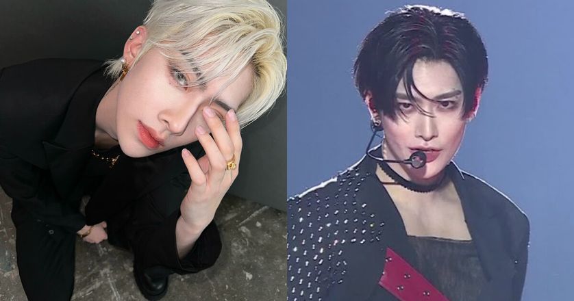
Mnet is receiving backlash from ZEROBASEONE fans for removing member Ricky from a video thumbnail.
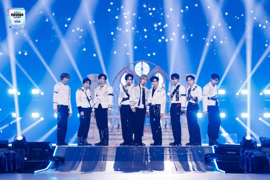
The video in question is the group’s performance of “Good So Bad” from the 2024 MAMA Awards. The photo originally included Ricky on the left…

…but Ricky was later edited out of the photo, leaving just Yujin in the center.

Turns out, this wasn’t the first time Mnet has removed members from the thumbnail.
What sinophobic mnet did :
1. Moved Hao’s thumbnail from most viewed clip (662k views) to least viewed clip (and Ricky thumbnail removed because of the change).
2. Cropped Ricky from another thumbnail like what?mind u this always happen to same people, fawk you mnet snakes https://t.co/Cmfzw60gLB pic.twitter.com/QdQcK5amyu
— lea ୨ৎ (@haobows) November 27, 2024
However, Korean netizens were divided on the issue.

- “I don’t understand why such a talented guy like him is receiving treatment like this.”
- “It doesn’t make sense that they deleted him. Or they shouldn’t have used that thumbnail in the first place. The comments are just ridiculous. How would you feel if your bias was removed like that? Even if the thumbnail has been restored, I’m still mad that he is being treated like this.”
- “It doesn’t make sense that they deleted it in the first place. Why are they saying the photo of him deleted is better when fans are upset? The comments are just rude. Imagine if your bias was treated like this.”
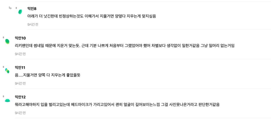
- “The bottom photo does look better, but I understand why fans are mad. If they were going to delete him, they should have deleted everyone in the background.”
- “I’m a Ricky fan and I think they did delete him for the thumbnail. But I’m frustrated because if they were going to remove him, they should have done it before posting it. It just annoys me that they didn’t think it through before posting.”
- “If they were going to edit him out, they should have edited out both sides.”
- “I guess they thought it was better to erase him because his pose was a bit awkward, making his face look longer.”
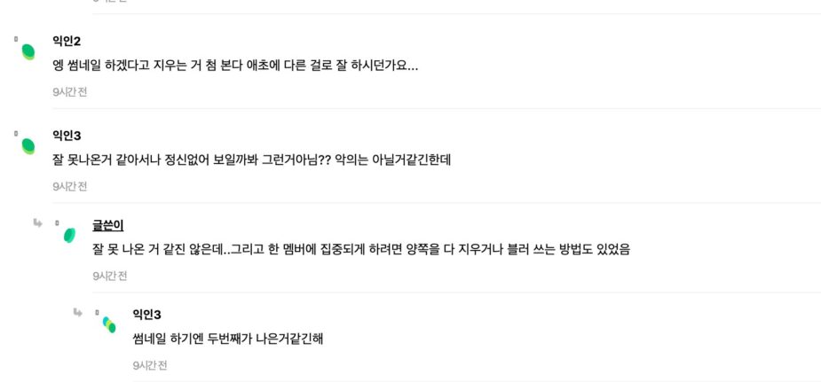
- “This is the first time I’ve seen them erase someone for the thumbnail. They should have just used a different photo in the first place.”
- “Maybe they erased it because it made the photo a bit distracting? I don’t think they did it with bad intent?”
- “I don’t think he came out bad in it…and if they were erasing him to focus on the center, they should have deleted both sides.”
- “The second photo seems a bit better as the thumbnail though.”
What are your thoughts on this?
Mnet Accused of Sinophobia After Editing “2024 MAMA Awards” Thumbnails