Here’s why fans think EXO and INFINITE have the most interesting logos
These two idol groups are said to have some of the most beautiful and dynamic logos among idols.
Every idol group in the industry is known to have their logos for their groups that are designed to represent the theme or heart of the group for use on things like merchandise and albums, as well as a way to identify with groups and fans.
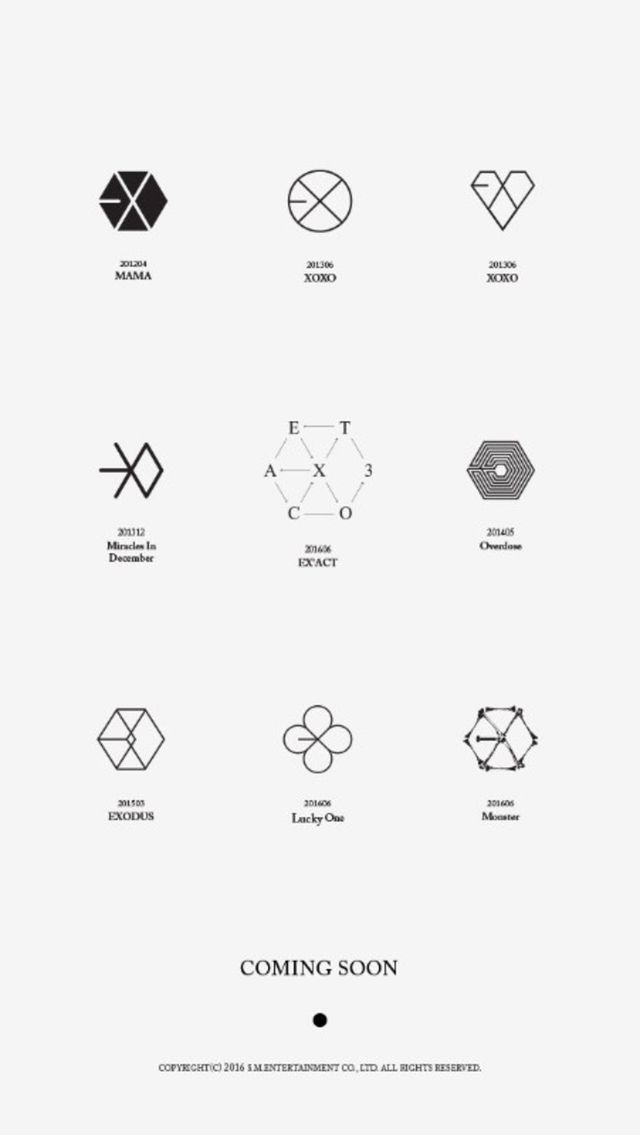
EXO and INFINITE are said to have the best designs for logos due to their versatility and ability to be reinvented. Fans have noticed that with every comeback, the logos have managed to keep their core intact, while also being flexible enough to fit each new concept!
This has made the two groups unique in that their logos have always been slightly different for each comeback.
Check out some of these variations below!
EXO

