BABYMONSTER Reveals Polarizing Lightstick Design

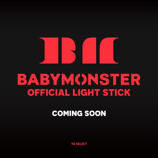
BABYMONSTER recently announced the group’s official lightstick and fans have mixed opinions on the design.
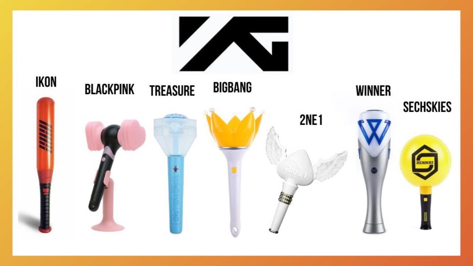
YG Entertainment‘s groups are known for their unique and fun designs that embody each group’s individual color and style.
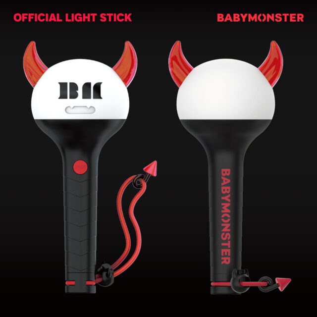
BABYMONSTER’s design features a red horns and vampire teeth with the group’s logo in the center. It also has a red wrist strap that looks like a tail.
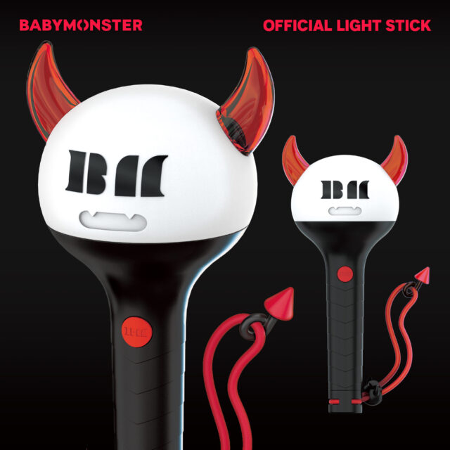
Additionally, the textured handle features the group’s name.
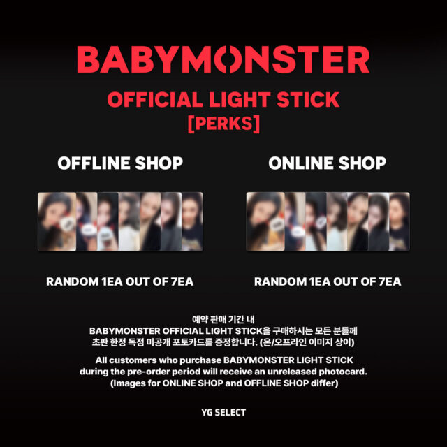
The lightstick comes with 1 out of 7 photocards.
However, many fans have varying opinions on the lightstick. Some shared that the design is more like a devil than a monster and may be seen as insensitive to their religion.
My Christian mom would definitely beat my ass if she found out i have this in my room 😭
— Ace (@dmpforAce) October 22, 2024
My family will judge me hard I don’t think I can it cause my family is devoted Christian 😭😭 the horns will be a lot 😭
— 𝓢𝓪𝓫𝓻𝓲𝓷𝓪ಇ˚☆ (@zaraglow4ever) October 22, 2024
Others found the design too plain and anticipated something more original.
This is too bad in my opinion, YG Can make it better and have characteristics like other brand groups Not only circle like this😭
— Mood16 (@AgoodMood16) October 22, 2024
I don’t like it. Compared with others, it’s not creative. I feel that they don’t design with their heart.
— Vanessa (@Vanessalyfe77) October 22, 2024
it’s cute, but i don’t really like it because it’s too simple
— ema𐙚˙⋆.˚ ᡣ𐭩 (@koleksibukubio) October 22, 2024
However, other fans believe that the design, down to the small details, is a perfect representation of BABYMONSTER.
As someone that already love it since they show the prototype eventhough many people hate it, i love it even more. Its simple but cute n i love the detail on it. BM alphabet as monster eyes, little mouth with cute fangs, the horns n monster tail too. It represents Babymonster
— Kambing menyalak (@embekkkkkk) October 22, 2024
Korean netizens the unique design for its cute details.
- “The string idea is good.”
- “Wow, YG seems really good at making things like this.”
- “Cute.”
- “YG is really good at designing. It’s cute, haha.”
- “Cute.”
- “Cute, haha.”
- “Oh, the tail is cute, and it’s much cuter than the prototype, haha.”
- “Cute, haha. It really looks like a baby monster.”
- “Whoa, cute, haha.”
- “It seems to suit the group and is cutely made, haha. The pointy thing is adorable.”
- “The tail is cute, haha.”
