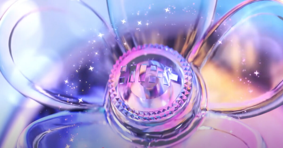
On February 28, ILLIT officially dropped a teaser for the group’s light stick, garnering much fan attention.
In the teaser video, a clear and simple light stick was revealed.

With it’s simple design, many were excited to be able to decorate and customize the light stick.


The magical and dreamy concept of the light stick seemed to match well with the group’s image.

While some felt that it could have been a bit more fun and cute with the design, others felt it showcased the group’s concept with just enough room for fans to be creative.


- “The design is not bad, but the rose reminds me of ‘The Beauty and the Beast,’ which doesn’t connect with their concept.”
- “It’s pretty, but I’m scared it’s going to break easily.”
- “I wish it was a bit more fancy.”

- “It was made perfectly to customize.”
- “But it’s really pretty.”
- “It reminds me of the rose from ‘The Beauty and the Beast’.”
What are your thoughts on the design?
Source: instiz